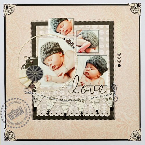
This week is Photo Focus Week on the Pink Paislee blog and we’re going to be showing you projects that feature three or more photos. A lot of scrapbookers struggle with getting multiple pictures on a page, myself included, so this week should be inspiring and motivating for those of us who need an extra push to get beyond those single-photo layouts.
This is actually the very first page I have scrapped of my new baby girl. That is intimidating! I knew I wanted to show off more than one of the photos from this little home photo shoot, and I wanted the focus to be on her sweet face more than lots of layers or embellishments.

It can be tricky to design a multi-photo page without it looking cluttered. I used the soft, subtle patterns of London Market here because they coordinated with my photos perfectly without being distracting… the paper and embellishments let the photos be where your eye is drawn.

I border cut five layers of scalloped grey patterned paper as a base for the twine-strung banner that anchors my photo grouping. I outlined each photo in fine black pen to frame them and unite the group. The photos themselves are small ,but as a collection (much like a gallery wall) they have a bigger impact.

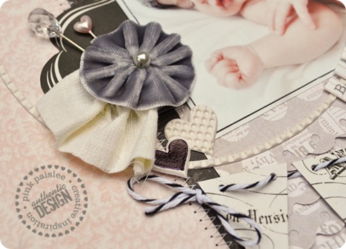
The new Artisan Elements were excellent accents for this page. Their white background allowed me to add black details to coordinate with the rest of my page. I used a Sharpie to outline where I wanted them to pop.

Simple and subtle details like this cluster compliment rather than distract from the photos. I absolutely love the combination of London Market and the Artisan Elements. So sweet!


1 comment:
Uh Oh - that FABULOUS LO is making me feel like I need another baby (or at least a really good lesson on how to use my camera!!)
Stunning photographs and a gorgeous LO. Hope you are getting some sleep :-)
Lowri
Post a Comment